

What you need to know
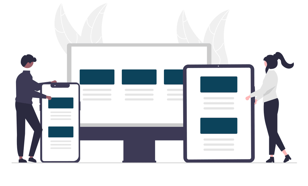
Responsive web design means that your website looks good and behaves correctly on any screen, of any shape, at any time. This means that there will be slight differences in the appearance of your website depending on if you’re looking at it from a desktop, a tablet, or a phone. Elements of the site will rearrange themselves quickly and properly to make the most sense to the user and the device they’re using.
Think about the menu of a website: where you might hover your mouse on a desktop to view it, that same menu needs to be clickable from a tablet. Or consider where a contact button would make the most sense to appear on a desktop versus a phone.
— Check this out:
A website built with responsive design is informed on how you’re viewing a webpage: your browser type, the device you’re using, your screen size, and your device’s orientation. If you look at the grey block below it should accurately describe how you’re viewing this page. If you’re on a tablet or phone, tip it so you’re in landscape mode. Notice how the description changes as your view changes? That’s responsive web design.
Does your website transition easily between device types? If not, we can help. We create websites with Responsive Design, and we’re confident that we can make whatever you’ve already built into a site that’s responsive and mobile friendly.
The browser you’re using is: . You’re viewing this: . The dimensions of your window are: .
— Why do you need responsive design?
Users will decide within 50 milliseconds whether or not a website is worth staying on (according to this blog post on CXL.com). That’s not a whole lot of time to capture the attention of a user. Making sure your website has responsive design can mean the difference between making a great first impression on a potential client, or delivering a frustrating online experience that deters them from pursuing business further with you.
— Responsive Design By Suffolk County Webmasters
EVERY site we build is responsive by design. While building sites we test them over a full portfolio of devices. This is not an optional extra. As far as we’re concerned a website is only correctly built if it is responsive.